10 Email Marketing Campaigns You Should Check Out Right Now
As a marketer, innovation and inspiration are the twin engines that drive your success in this fast-paced, digitally connected world. Sometimes it’s essential to pause and survey the landscape in order to find that jolt of inspiration that enables you to really push the envelope for your organization.
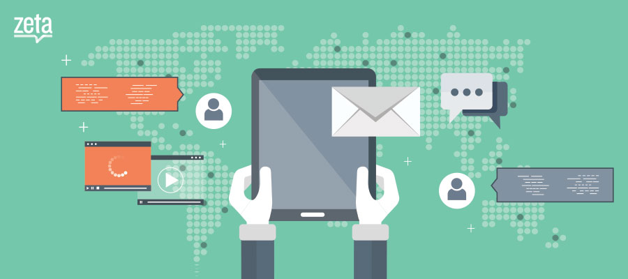
Email marketing is still of the most effective ways to inspire your audience, and it remains the channel to beat when it comes to driving sales, support and customer engagement. In fact, 73% of businesses still identify email as the best way to drive their marketing goals in 2016.
Of the 80 billion emails exchanged daily, about 40% are between brands and customers. So if you’re looking some inspiration right now, we’ve identified the top 10 email marketing campaigns you should check out.
Welcome email campaigns
Spark’s Welcome email
Spark is an email app exclusively made for Apple devices such as the MacBook, iPhone and iPad. It was launched in 2015 and immediately made it Apple’s “Best apps of 2015” list.
Once you download and register for Spark with any one of your Apple devices, Spark sends out a beautifully designed, highly informative welcome email. Welcome emails from most brands are just a simple thank you acknowledging your patronage, but Spark takes it several levels further. A good welcome email marketing campaign should inform of the app’s purpose and inspire you to leverage its features for maximum productivity. Spark addresses exactly that.
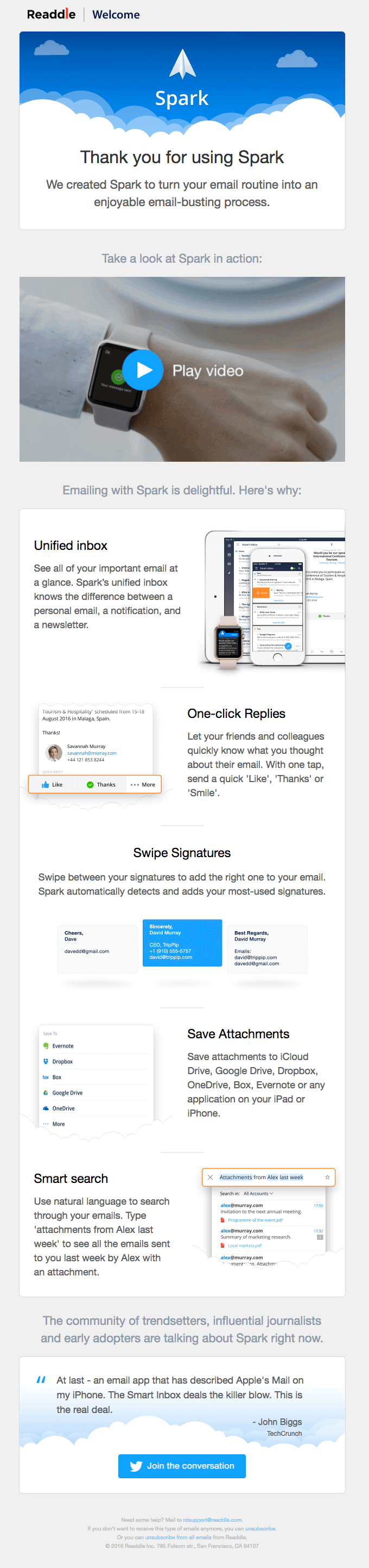
Spark’s welcome email can be split into 4 parts –
- The first section conveys how happy they are to have you on-board.
- The second section is where the magic starts. Knowing that most users prefer watching a video about a product rather than reading about it, Spark intuitively added a product overview video before getting into the deeper details.
- The third part presents a compelling case for why you should use Spark, rather than any other email client on your Apple device. They apply best design practices by including product visuals and adopting a zig-zag reading pattern, which most users prefer.
- The 4th and final section shows a Tweet by John Biggs from TechCrunch with a CTA to Join the Discussion. This successfully promotes Spark via a testimonial from a highly regarded tech reviewer and encourages its new users to become promoters themselves.
Spark has delivered a perfect example of a well executed welcome email campaign. Flawless design, intuitive segmentation and just the right amount of content. This email both validates the user’s decision to use Spark, and educates them on how to make the most of their purchase.
Skyscanner welcome email
Skyscanner calls themselves “the world’s travel search engine,” and they are quickly becoming the go-to app for people looking to book affordable, convenient travel all in one place. The Skyscanner app aggregates content from most popular travel websites from around the world and presents it in a slick, intuitive interface either on the web or via their widely used mobile app.
Once you sign up with Skyscanner, they send you a crafted beautifully and immensely useful welcome email. The same consistency follows throughout their email marketing campaign.
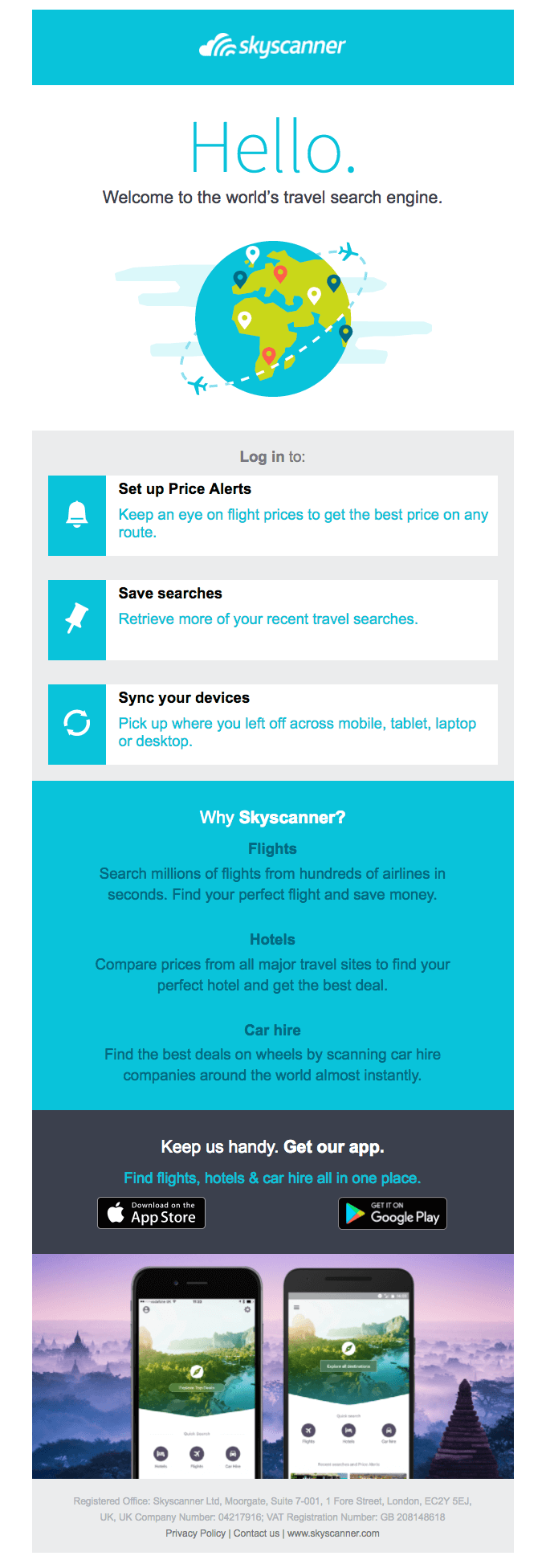
The email could be broken down into three parts –
- The first section is the standard friendly welcome message.
- Second section tells you about their unique functionality and how it benefits you as a user.
- The third section states their value proposition and competitive advantage in clear, succinct language.
- The final fold is a call to action encouraging you to maximize your experience by downloading their mobile app, if you haven’t already.
Overall, it’s a quick read, but nevertheless provides a compelling—and beautiful—story around their core benefits, and positions them as the only travel booking app you need.
Product email update campaigns
IFTTT product update email
IFTTT is one of the most popular software automation services available today. After its incorporation in 2011, IFTTT quickly became the de facto choice for automating and connecting various “internet of things” technologies with simple user-created triggers. By 2014, IF (parent company of IFTTT) was valued at $170 million.
IFTTT has a wonderful on-boarding process as well as a great template for introducing product updates via emails.
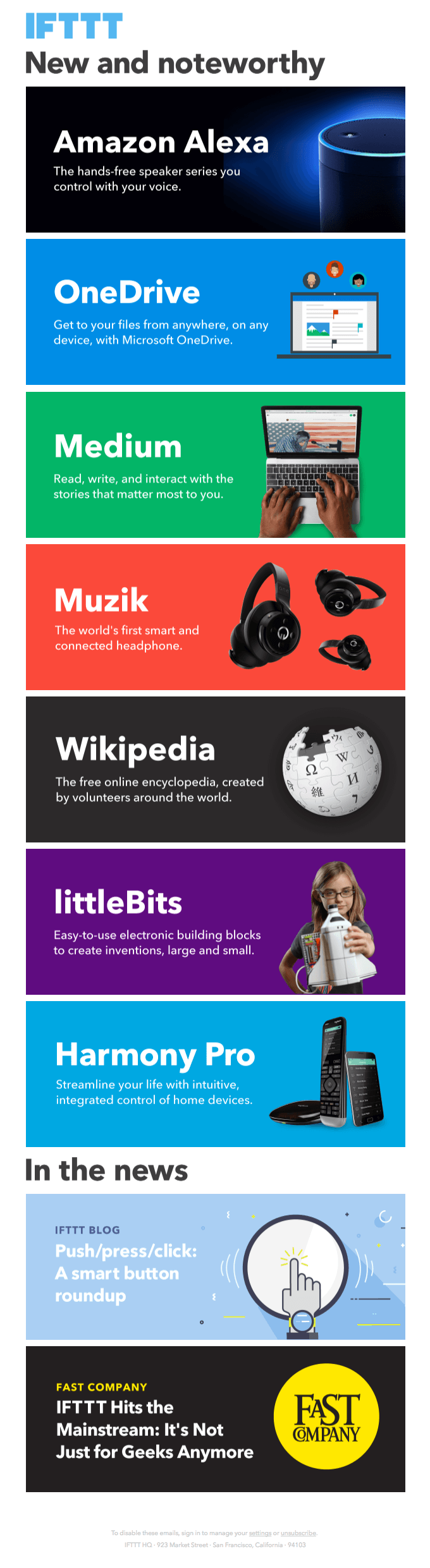
This email is modular, and can scale up or down based on the amount of content they have to share.
- Design: The design is very distinctive and easy to scan. Each new feature or update is color coded and introduced with large font and low text density to catch the eye of the reader. You can see that the fonts are large in size and the text density has been kept low and to the point, throughout the email.
- Content: The email is strictly focused on the updates. By focusing on the core product message and not adding a lot of brand-level marketing content, they ensure it delivers maximum value to the reader.
It’s a quick, value packed email that allows the user to focus on what’s relevant to them. If you look at other examples of IFTTT’s emails, you’ll see the same kind of uniformity across all channels.
Todoist product update email
Todoist is probably one of the most popular work tracking and to-do list services available for all major mobile and desktop platforms.
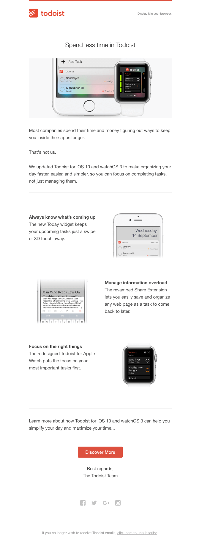
Todoist sends out well-crafted email newsletters and product update emails, and what really stands out is how well they can weave a whole email around one simple product update.
This email for the new updated version for Todoist on iOS 10 and watchOS 3 makes it clear that this update is delivering serious and specific value to the user. It weaves an entire email based on the integration of their iOS app with the apple watch, with compelling visuals and clean layout.
Promotional email marketing campaigns
Uber Promotional emails
The beauty of Uber email marketing campaign lies in their simplicity. Uber lets its users know new promotional campaigns with lightweight emails like the shown one below. They disclose the offer with a short description and a clear and prominent call to action. This email wa clearly designed or people who have a tendency to skim their emails.
For those who want to learn more about the offer, there is a more detailed description just below.
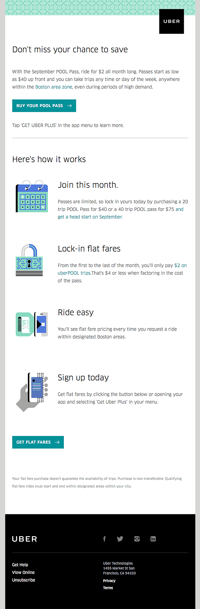
Another point to be noted in Uber’s email is their focus on uniformity across all channels. All the emails adopt the same design language as their website and mobile applications, with the same vibrant colors and flat graphics creating strong brand recognition and encourages loyalty.
Birchbox promotional email marketing campaign
Birchbox emails always begin with magnetic subject lines.
For instance, this email below had a subject line Lucky You!: There’s Still Time to Claim Your Prize
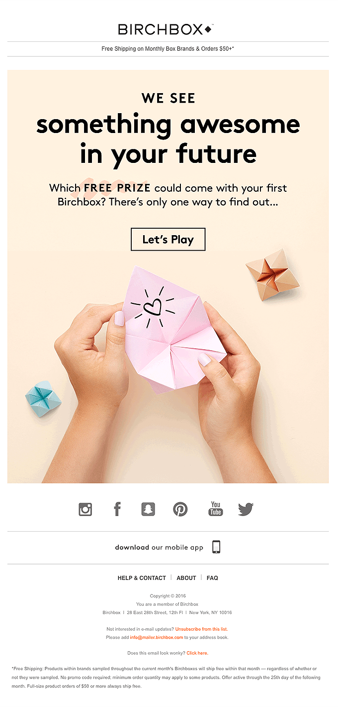
The subject lines are catchy and play on the consumer’s natural inquisitiveness. The body of the email goes on to inform the reader that there is some sort of a prize waiting and encourages them to take action to discover exactly what they’ve won.
It’s playful, on-brand, and presents the user with a compelling (and tangible) reason to engage more deeply, without feeling like clickbait.
Upselling email marketing campaign
Grammarly upgrade email
Grammarly is a Machine learning based grammar correction tool that’s considered to be the leading service for flawless and affordable proofreading.
Their upgrade emails are some of the best we have ever come across. Grammarly offers 2 tiered plans for its product, the first being a free plan and the other a pay-per-month paid plan.
Grammarly excels by putting their user’s data to good use as a marketing tool. They use the recipient’s personal usage data to neatly weave a personalized story.
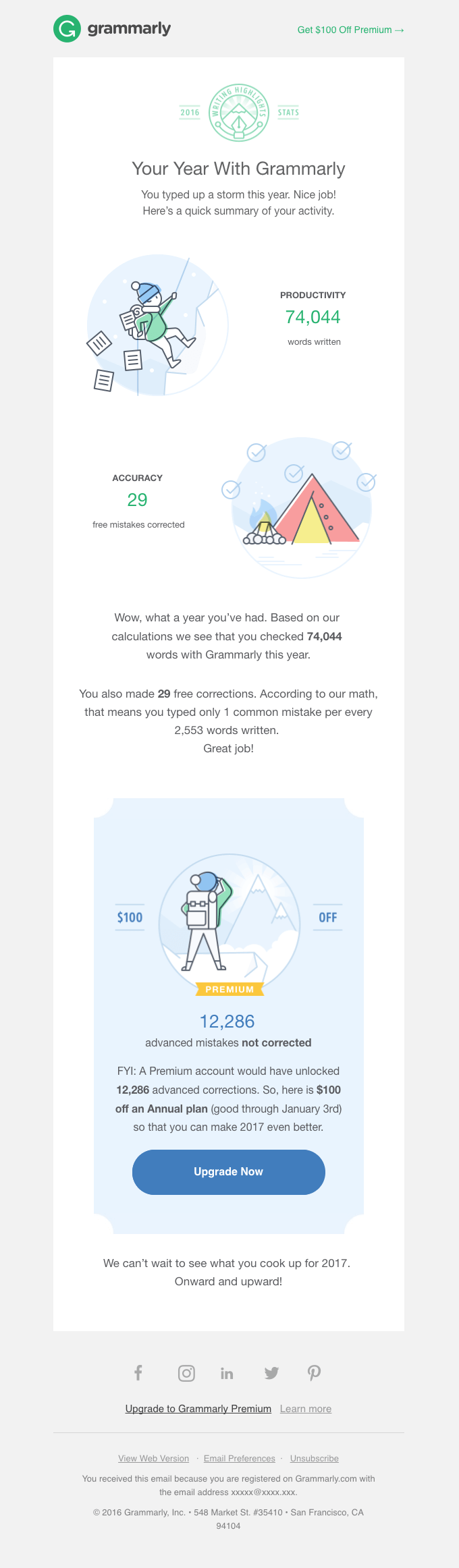
Stats like corrections made, words typed, and text verified show you exactly how Grammarly has helped that individual over the past year and helps the reader quantify the value their services add. Grammarly smartly ends the email by showing the reader how many mistakes they could’ve have corrected if they had a premium account. These personal insights give the brand a concrete basis on which to make an offer to the user that feels more tangible than an abstract list of features. Plus, the $100 discount makes an even more compelling (and urgent) case for the reader to sign up for a premium account.
Evernote year end upgrade offer
Evernote is a note-taking app known for its ease of use and cross-channel capabilities.
Their approach to this upgrade email shows a strong grasp of marketing fundamentals: If you want your users to buy into your product, give them a reason to do so. Evernote’s email design is elegant and minimalistic and the offer is focused easy to understand.
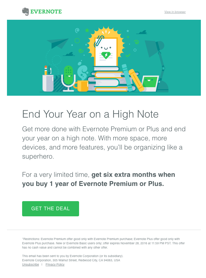
User’s know what they can get and exactly how to take action to get it. No need to scroll, no distractions. This email reinforces their user-centric approach to product design and their focus on seamless productivity.
Win-back emails
Runkeeper elite
Runkeeper does a great job of re-engaging and winning back customers by sending them targeted emails about product updates, with a focus on how those updates can help the user achieve their goals, rather than focusing on the functionality itself.
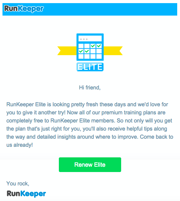
Their emails are brief and to the point with scrolling and a single call to action. The overall tone is less a plea to come back, and more of a compelling “FYI” for people who may have lost touch with the app.
Udemy retention emails
Udemy’s win emails offer users something tangible in exchange for their continued or renewed subscription.
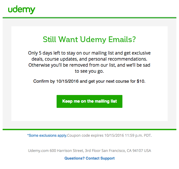
What really sticks out, is that Udemy is actively monitoring users who don’t interact with their email newsletters and that they will actively remove users who haven’t interacted with any CTA for the past 3-4 weeks.
This approach tells users that Udemy wants to be a valuable partner to them, not just another email in their inbox. And even though it may reduce their subscription numbers, it shows that they are a brand that understands that what really matters is engaged users. They show that they value the recipient by offering a discount on their next course, providing added incentive for them to engage with their course catalog, and not simply maintain a subscription.